About the event’s visual identity
Being an ephemeral visual identity, we gave ourselves the freedom to do without a traditional “logo”, and to only work with typographic, chromatic and graphic patterns to tie the material that accompanies the event.
Challenges
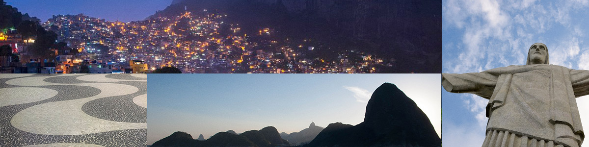
As it is an itinerant event (each year a different city), we decided to relate this edition’s host city and aspects it is know for — Rio de Janeiro, with its colors, curves and scenery — with elements of cryptography, maths and, in special, the hiding of messages.
Color and typography
As a matter of the moment we were called, we had to start with explorations of colors and typography, which were to be chosen before we could begin experimenting with form. This was because the event’s site was already online, and so we had to change it quickly before the temporary colors, which neither the client nor us liked, became definitive.
Still, we were able to explore three chromatic paths that, in our view, brought interesting aspects of the “Carioca” imagery, which we allied with typography that combined sumptuous curves with more orthogonal choices.
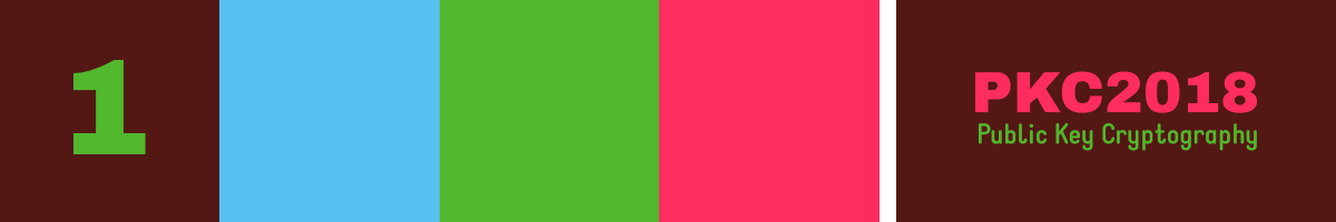
We presented the ideas to the client, who, from the above options, selected number 2 — which is currently applied to this site!.
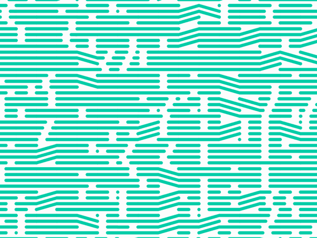
Experiments with ciphers
We looked for inspiration in concepts related to different approaches to hiding messages: encryption, of course, but also steganography and ciphers. The latter, in particular, served as inspiration for a first test, based on a children's code booklet. We created a simple Nodebox interpreter that converted simple texts into shape sequences.
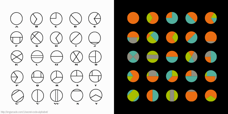

Pretty, but we felt that this solution was too obvious, in the sense that it was too self-evident that there was a hidden message — that is, the fact that there was a cipher was too much in the foreground, drawing too much attention to itself.
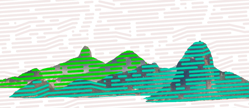
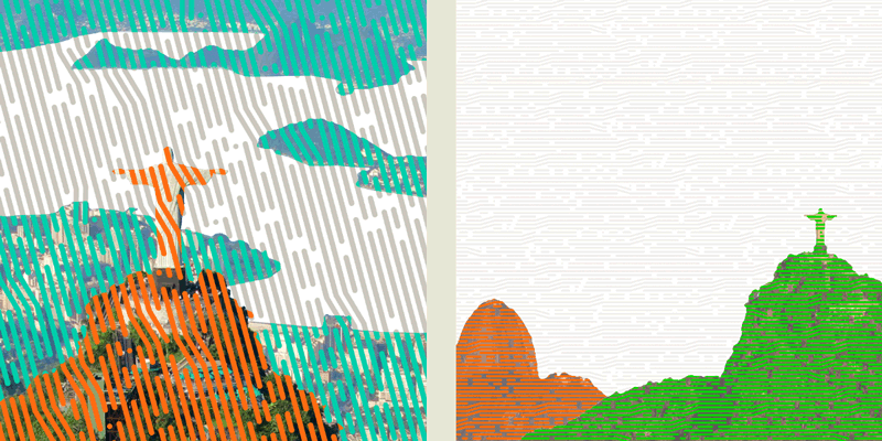
Graphic alphabet
The following experiments sought to solve a problem perceived in the previous attempt, producing images where the different elements weren't perceived as discreet entities.
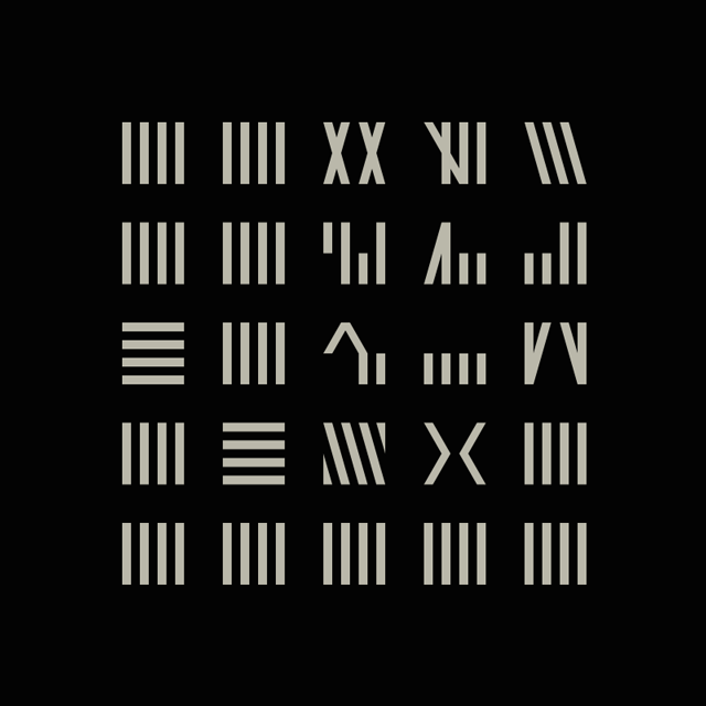
These images were then combined with pictures of Rio de Janeiro:
The next phase will be the development of the graphic pieces, which is where everything comes together. Follow this space!
In this project we've used photography from, and thank, Chensiyuan, Jens Hausherr, Leonardo Ferreira Mendes, Rafael Rabello de Barros, Ulysses Rj, Fabio Venni, Mike Vondran and tetedelart1855.
Project developed by Caluã Pataca, of estudinho. This text was written in October 2017.